In the realm of interior design, there’s a wisdom that suggests familiarity with rules precedes the act of breaking them—a sentiment particularly relevant to our discussion on this aesthetic discipline. This post is far from a guide on subverting legal norms; rather, it delves into the multifaceted nature of interior design. While it undeniably encompasses scientific facets, such as the rigidity of proportions, meticulous measurements, and adherence to physical laws, I vividly recall my initial disillusionment during my early foray into the field. The daunting presence of mathematics cast a shadow over my enthusiasm.
Nevertheless, it’s essential to recognize that interior design transcends its scientific underpinnings; at its core, it is an art form. An art form not easily imparted through formal instruction, but one that demands the cultivation of a discerning eye—an eye refined through experience. Much like Picasso challenged artistic norms in his era, mastering the rules of interior design invites the liberating stage of breaking them.
Here are 7 rules I like to break when it comes to decorating
Rule 1: Art for art’s sake
If, on the other hand, you prefer a canvas or lithograph hanging on your wall, then here is another rule I like to break. It is that art should be centered above a piece of furniture. While this is true in some cases, it all depends on the proportions. This is a little trick I learned. If the art is too small above a sofa, for example, centring it will just make it look even smaller. Offset it a few inches to the left. The negative space becomes part of the image.
Rule 2: Neutrals are timeless
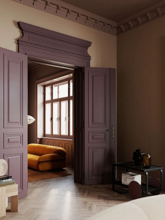
This makes me cringe. All this beige, greige, cream and white is like living in a bowl of oatmeal—safe but kinda dull, right? So here’s the deal: imagine having walls that are like your favourite cozy sweater, or of a beloved accessory. A bold colour that makes you feel all warm and fuzzy inside. Sure, people might say you’ll get tired of it, but seriously, when was the last time you got sick of your favourite colour—or song, or food, or whatever else you love for that matter?
Go wild! Pick a colour that makes you happy, whether it’s a moody midnight blue, a lively red, or a chill emerald green. It’s not about being over-the-top; it’s about choosing a colour that feels like *you*. And don’t stop at the walls—throw that colour into your cushions, blankets, and maybe even some funky artwork. It’s like giving your room a big, colourful hug. Break out of the ordinary and surround yourself with a colour that makes you grin from ear to ear every time you walk through the door. Life’s too short for boring walls!

Rule 3: Matching furniture sets
For too long, the furniture scene has been all about that picture-perfect match – sets so coordinated they practically finish each other’s sentences. But let’s ditch the predictability! Dive into the vibrant realm of eclectic design by tossing aside the notion of perfect pairings. Mix and mingle styles from different eras, throw in a dash of the unexpected, and voila – you’ve got yourself a curated masterpiece! This departure from the ordinary transforms your space into a kaleidoscope of personality, where each piece is a character in a captivating story. Break free from the conformity of matching sets and let your living space become a thrilling canvas of colours, styles, and eras, telling a tale that’s uniquely and unapologetically yours.
Rule 4: Avoiding Dark Colours and patterns in Small Spaces
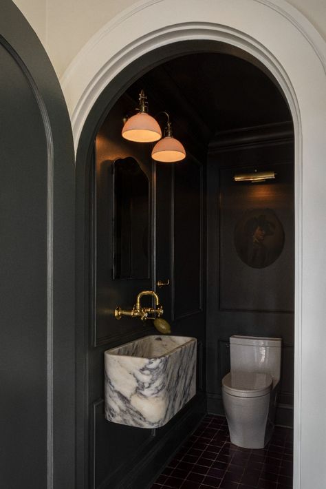
Breaking away from the conventional wisdom that dictates the use of light colours in small rooms, consider embracing dark, rich hues to infuse smaller spaces with both drama and a sense of coziness. Contrary to the traditional advice that patterns should be avoided in compact areas, challenge the status quo by incorporating bold and intricate patterns. Rather than shying away from visual interest, patterns can be wielded strategically to add depth and personality to confined spaces, transforming them from mere utilitarian corners into engaging and dynamic environments. In essence, the notion that small spaces necessitate light colours and simplicity can be reimagined, allowing for a more daring and aesthetically captivating interior design approach.

Rule 5: Scale and proportion are key
You always hear designers go on and on about scale and proportion, but as you know, sometimes the rules work best when broken. In small spaces, oversize and over-scale works best. It sounds contradictory, but your room will actually look bigger with a few big pieces of furniture. The key lies in strategically choosing these statement pieces to create a sense of grandeur without overwhelming the space.
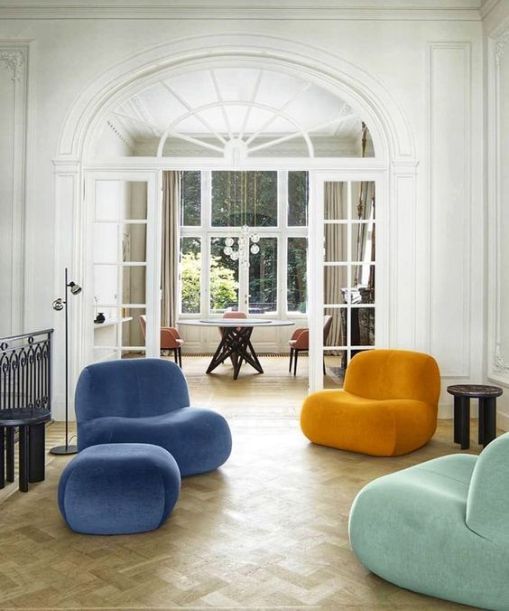
When you opt for larger furniture in a compact room, it minimizes the need for multiple smaller pieces that can clutter the space. This streamlined approach not only simplifies the visual landscape but also allows for more open floor space, giving the illusion of a more expansive room. Moreover, oversized furniture pieces can act as focal points, drawing attention away from the limitations of the space and redirecting it toward the intentional design elements.
In addition to the optical benefits, larger furniture often provides more functionality. Oversized sofas or expansive dining tables can serve as multifunctional pieces, accommodating various activities within the limited square footage. This versatility not only enhances the practicality of the space but also contributes to a more comfortable and inviting atmosphere.
rule 6: Wood grains don’t mix
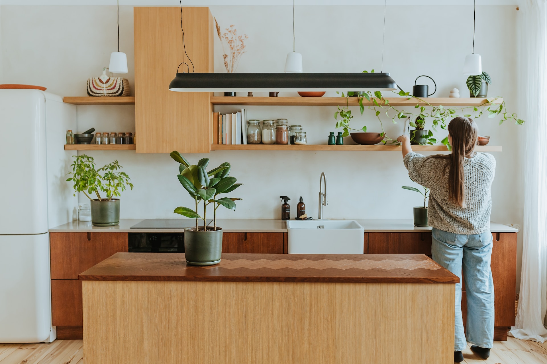
Dare to use different grains of wood… together. The diverse textures, tones, and patterns of different wood types create a visual tapestry that captures the eye and stimulates the senses. This design approach allows for a personalized and eclectic aesthetic, breaking away from uniformity and embracing the beauty of natural variations. Whether it’s combining rich mahogany with the subtle elegance of birch or pairing the rustic charm of reclaimed wood with the smooth finish of maple, the juxtaposition of various wood grains introduces a playful element that can evoke a sense of nostalgia or create a modern and refreshing atmosphere.
rule 7: There are rules in designing a room
So, here’s the deal: I’ve got this one rule, and I break it more often than not. It’s all about throwing out the rulebook when it comes to design. I mean, sure, we’ve got to play nice with building codes (seriously, no messing with those!), and there are these guidelines for chandelier heights and chair spaces (yeah, we know the drill). But besides that? Feel free to toss those old-school rules out the window. If you like the end result and it fits with your lifestyle, then it’s a win in my book. So, break free, get creative, and let your design rebel flag fly!
Photos: 1| 2 | 3 | 4 | 5 & 5a | 6
21
Thanks for this awesome article which offers concrete suggestions for breaking decor rules in a stylish and successful way.